Spotify for Artists
Spotify is a digital music, podcast and video streaming service that gives its users access to millions of songs and other content from artists all over the world. Spotify was first launched in Sweden in 2006 and is now available in over 79 countries serving 248 million monthly listeners. Spotify is currently the most popular global audio streaming subscription service.
Spotify’s continued success is attributed to its investment in cutting edge technology such as Artificial intelligence. Spotify’s decisions are greatly influenced by the data they’re able to gather. The information navigates algorithms and helps enhance user experience. A key feature provided by this technology is Spotify’s “Discover Weekly” playlists. Tracks are recommended to users that they might not have heard before or based upon their listening pattern.
Services
User Experience Research
User Experience Design
Client
University of Waterloo | Spotify
Spotify.com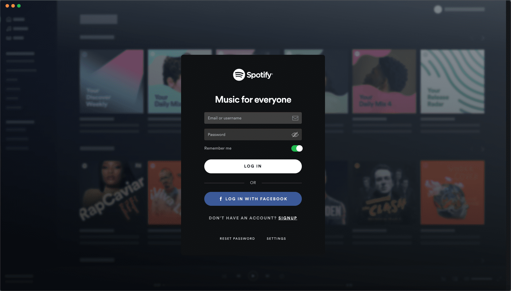
The problem
Musicians, have had little control when it comes to managing their catalogue on Spotify. For the first time, Spotify has decided to give artists control of their catalogues on their platform. Artists can manage their own albums, upload their own artwork, sell specific merchandise, add lyrics to their music etc. and it’s all on their own terms.
The Goal
Our UX team was therefore tasked with researching and designing a Mac-based editor and artist management system that allows artists to manage their presence on Spotify. The solution should account for all existing artist content on Spotify.
The primary project constraint is that the solution must be a Mac desktop app and as such, the application will be relegated to the OS’s abilities.
My Role
As the Team lead, I’ve been responsible for ensuring that our objectives and activities throughout the research and design process are planned and executed accordingly. I conducted and analysed interviews with artists from the local music community as well as actively contributing to the Interaction Design, Visual Design and Usability testing of the desktop application.
Research Stage
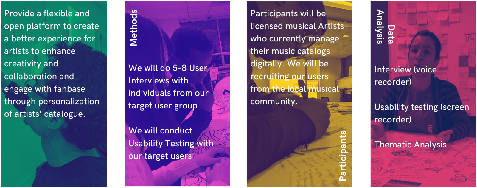
With research at the forefront of our design thinking approach, we began by establishing a team contract and outlining a research plan containing our key research questions and point of view statement.
How might we use a Spotify customized catalogue to help artists improve interaction and engagement?.
An Artist who lives in a growing town, needs to have the freedom to manage and customise their music catalog digitally as well as engage with listeners to increase their fanbase but needs a platform that will allow them the opportunity to do so.
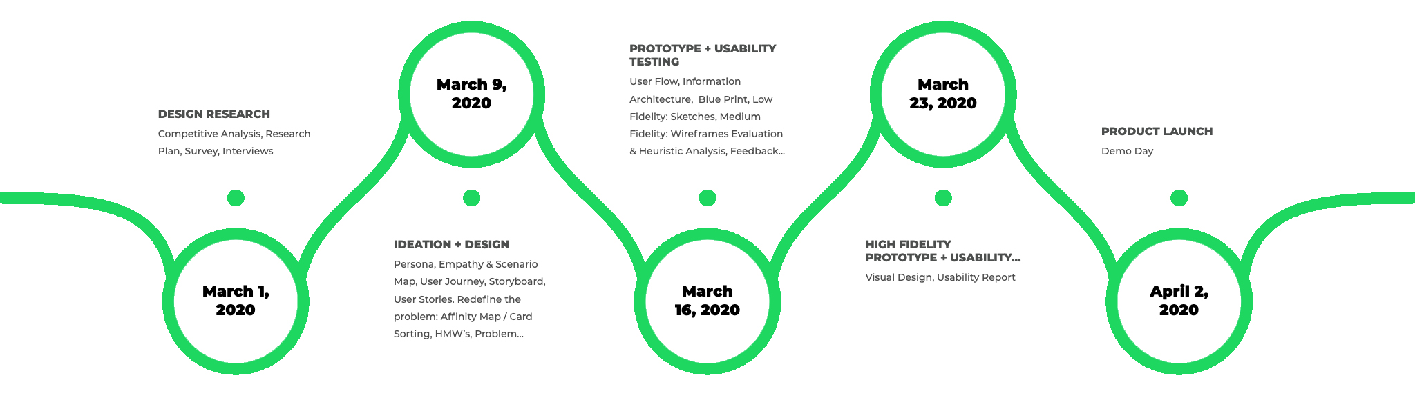
In order to generate a holistic and empathetic understanding of the problems that artists faced, we esatablished a timeline that would allow for us to continue reviewing our findings and initial assumptions. This meant that our designs would be iterated rapidly as we became more informed to towards the final stages of the design process.
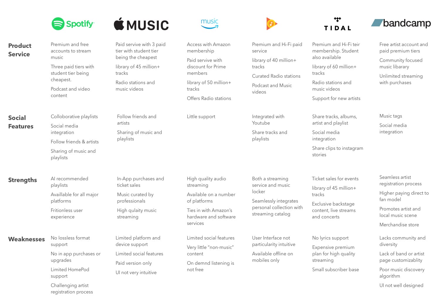
A competitor analysis was done on the major players of the digital music streaming market to help us further understand Spotify’s position and each competitors' strengths and weaknesses.
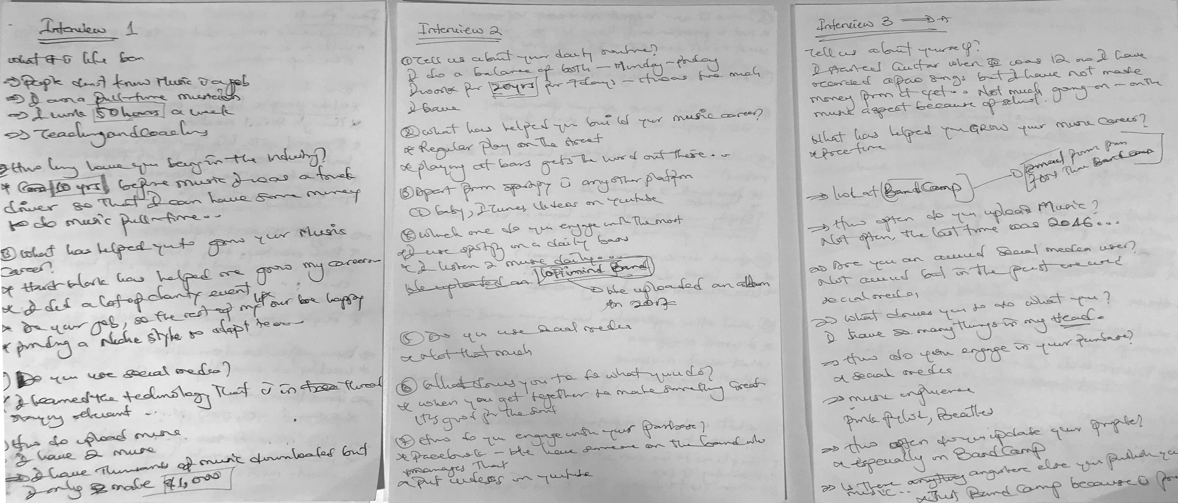
User Interviews
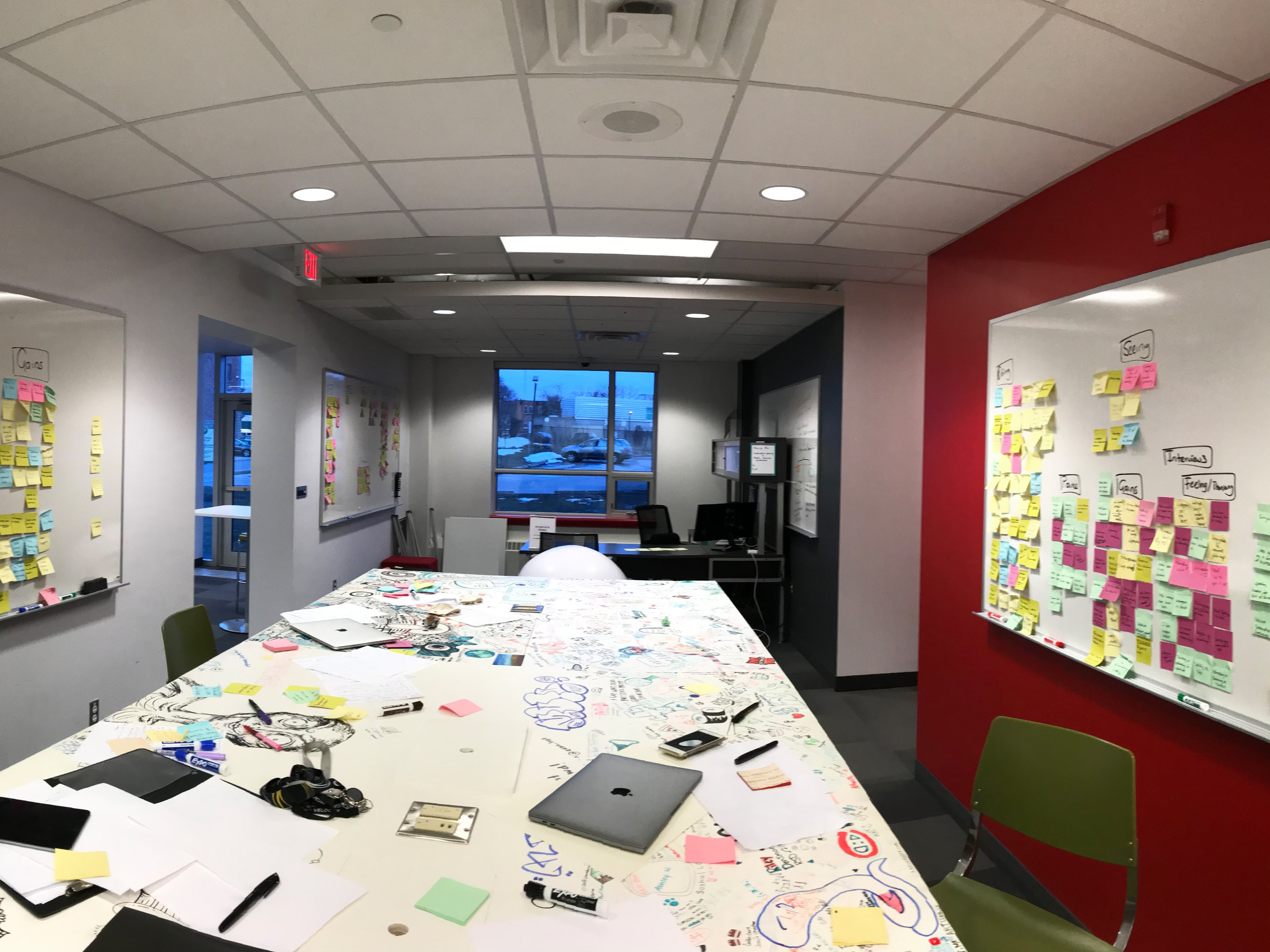
We engaged with Artists from the local music community to gain an empathic understanding of the problem that we were trying to solve by immersing ourselves in the physical environment and observing their behaviour. Based on our screener, we then recruited a few of the Artists whom we interviewed to gain additional understanding their experiences and motivations.
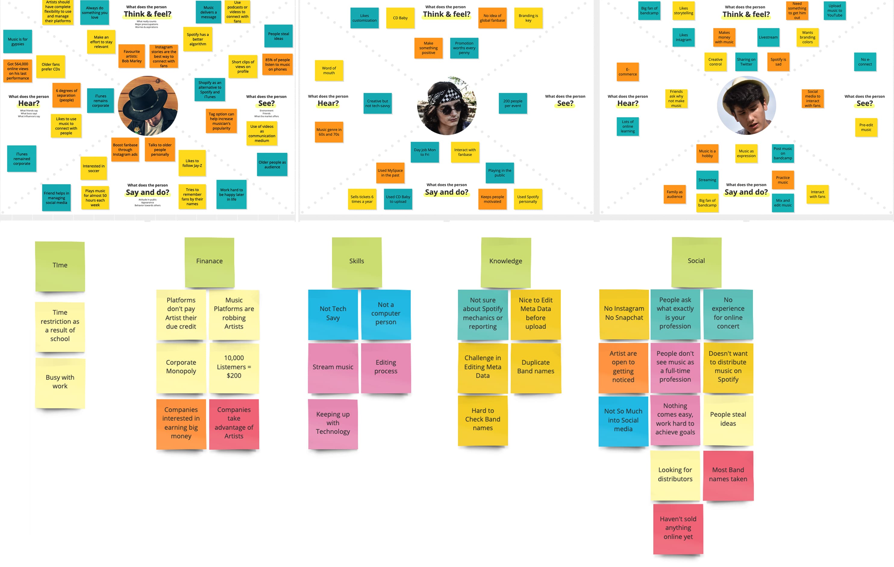
Empathy Maps
By synthesizing our findings into compelling needs and insights, we created empathy maps for each user category. Patterns in the data were uncovered that allowed us to define and scope a specific and meaningful challenge.
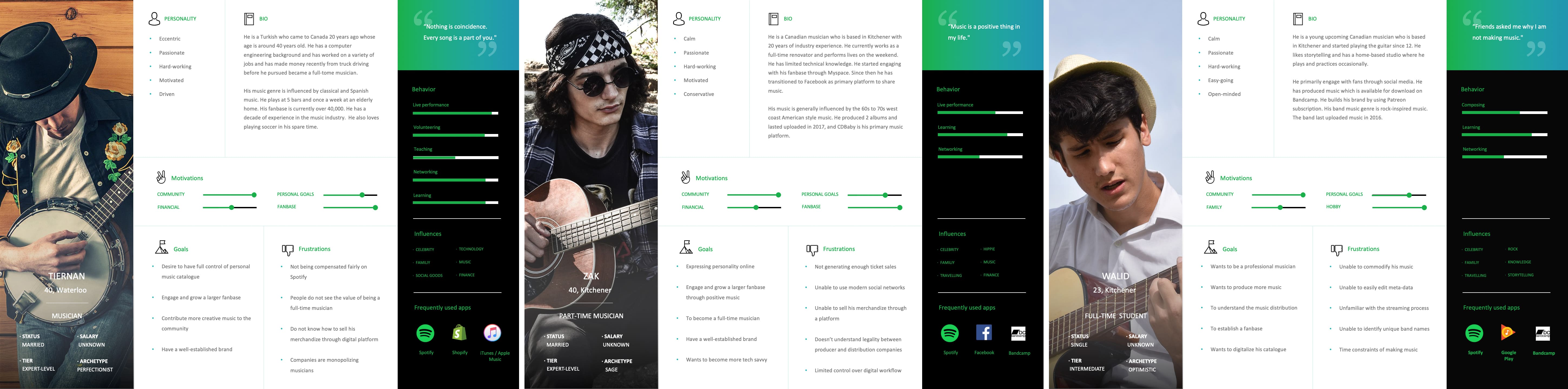
Personas
Using data from our Empathy Maps, we crafted three personas that represented our targeted user base. This further helped with identifying and understanding the users we were designing for.
Discovery & Planning Stage
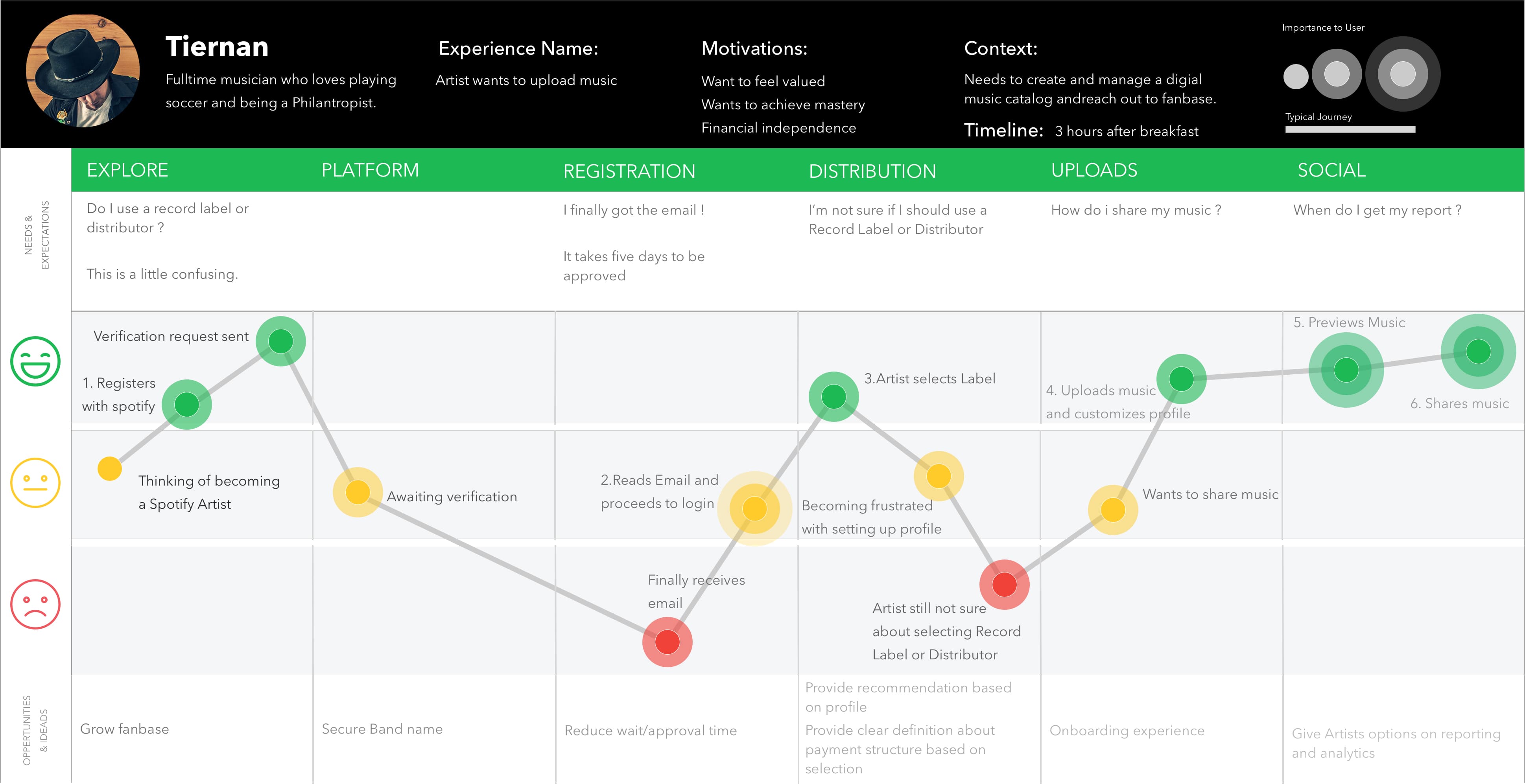
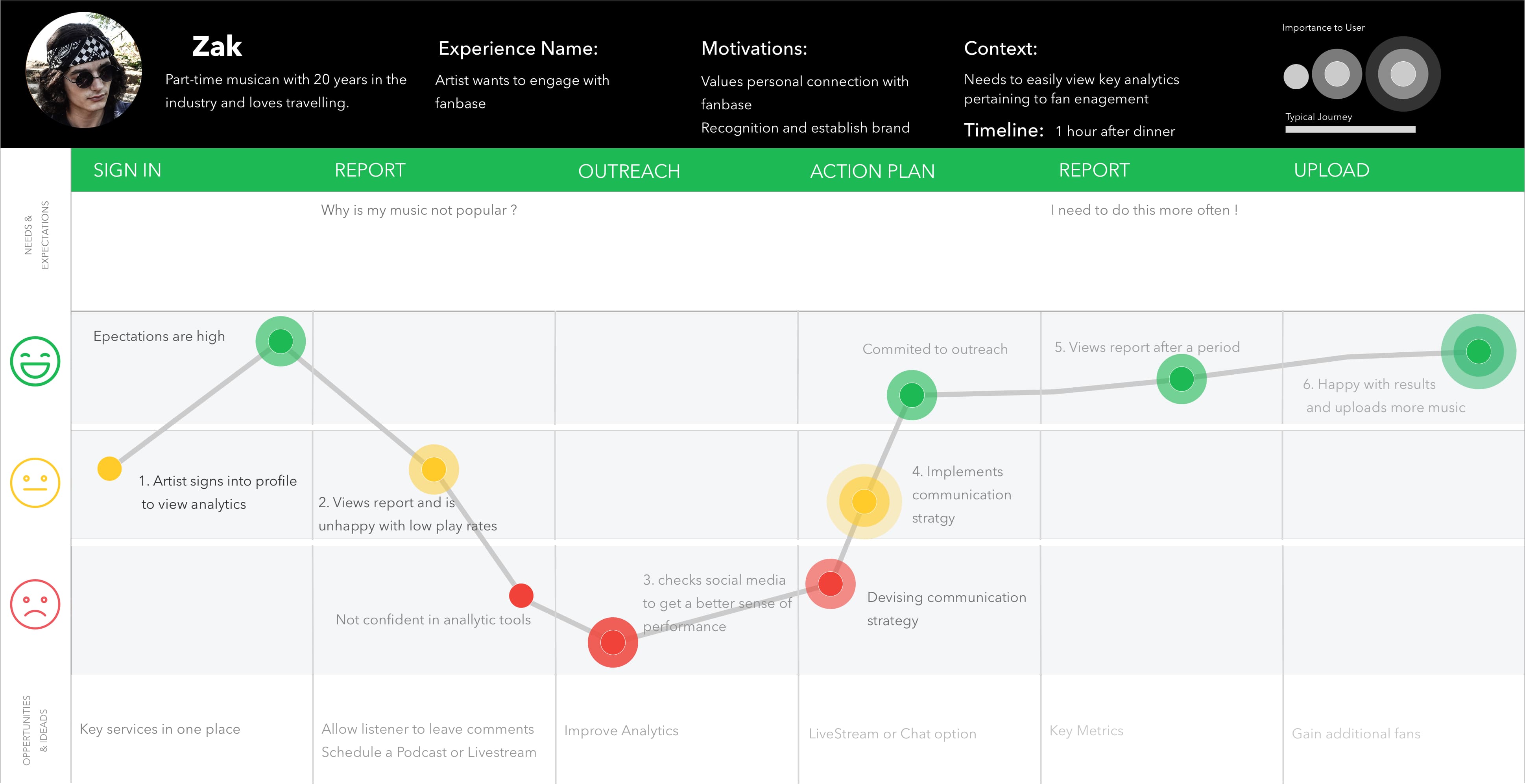
Journey Maps
We next focused on the user’s experience for both an experienced an inexperienced user when interacting with Spotify across all touch points and channels. Each of these interactions directly affects the satisfaction of the user’s needs and ultimately the user’s dedication to the service. Additional insights and key opportunities were uncovered to further inform our design choices.
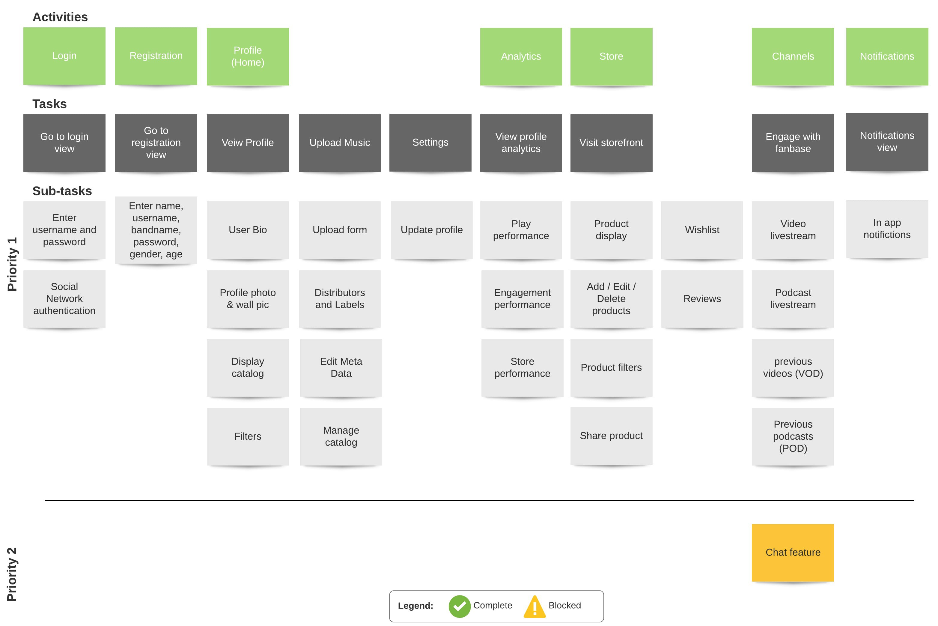
Story Map
We conducted an ideation session where we organized our findings into key action statements and redefined the problem.
How might we provide a flexible and open platform for Artists ?
How might we create a better experience for Artists to enhance creativity and collaboration ?
How might we allow Artists to engage with fanbase through personalization of Artists’ catalog ?
How might we provide an Artist with key analytics data ?
How might we provide an Artist with the ability to sell merchandise ?
With an informed decision, we mapped each feature for our minimum viable product through a User Story Mapping workshop.
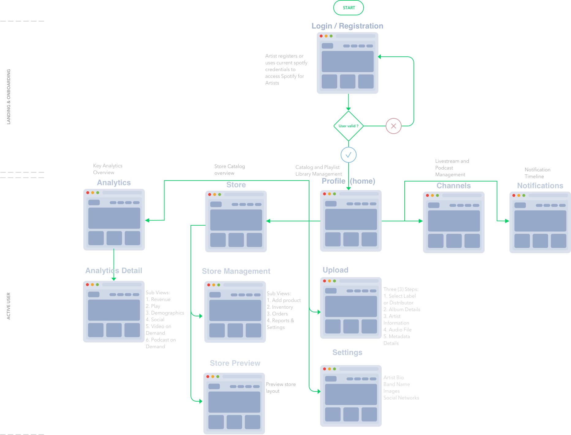
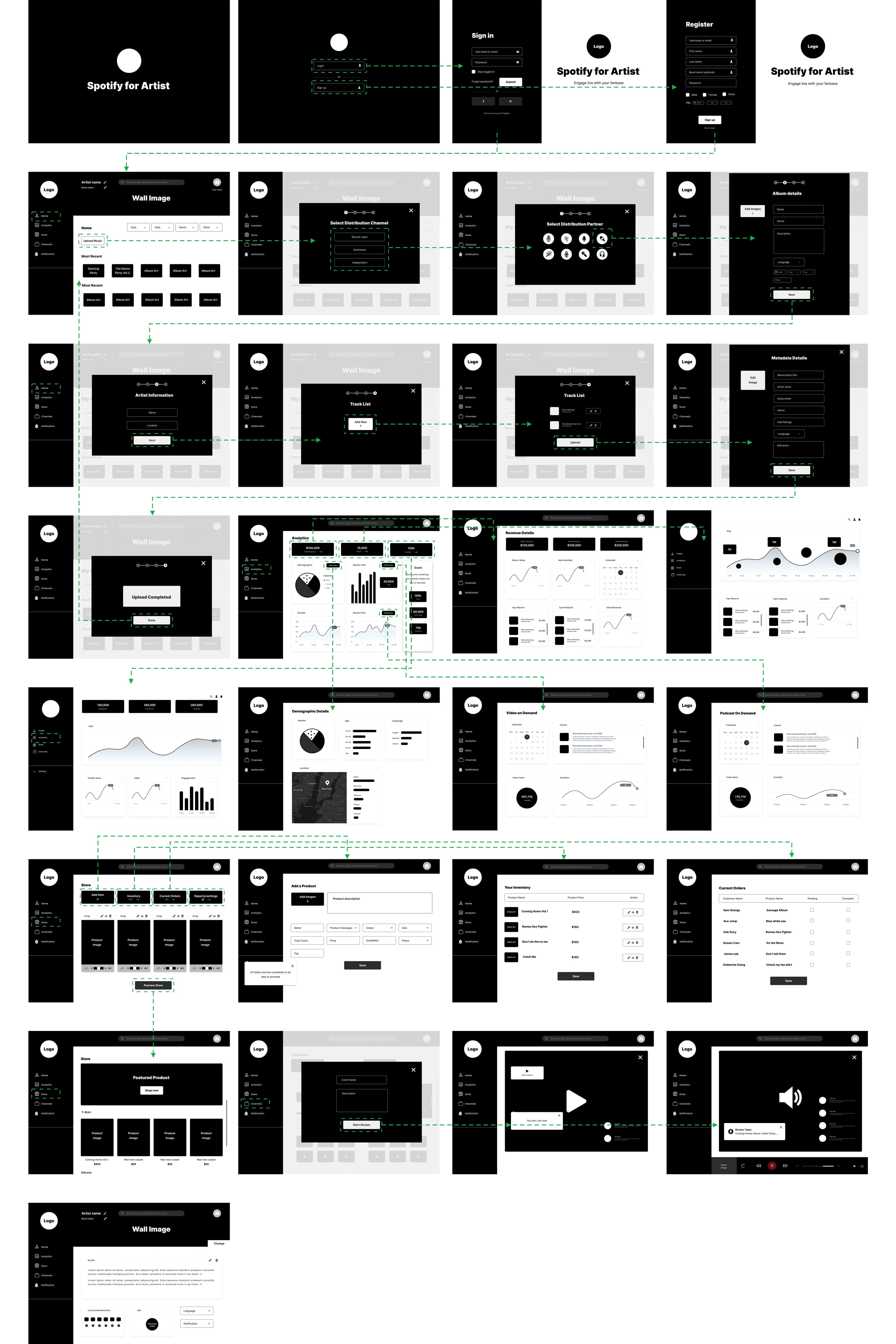
User Flow
The User Flow outlines the path an Artist would take when using the application to manage their catalogs and engage with fans. This ensured that we could visualize all the necessary screens that might be required and scenarios that might occur during user interaction.
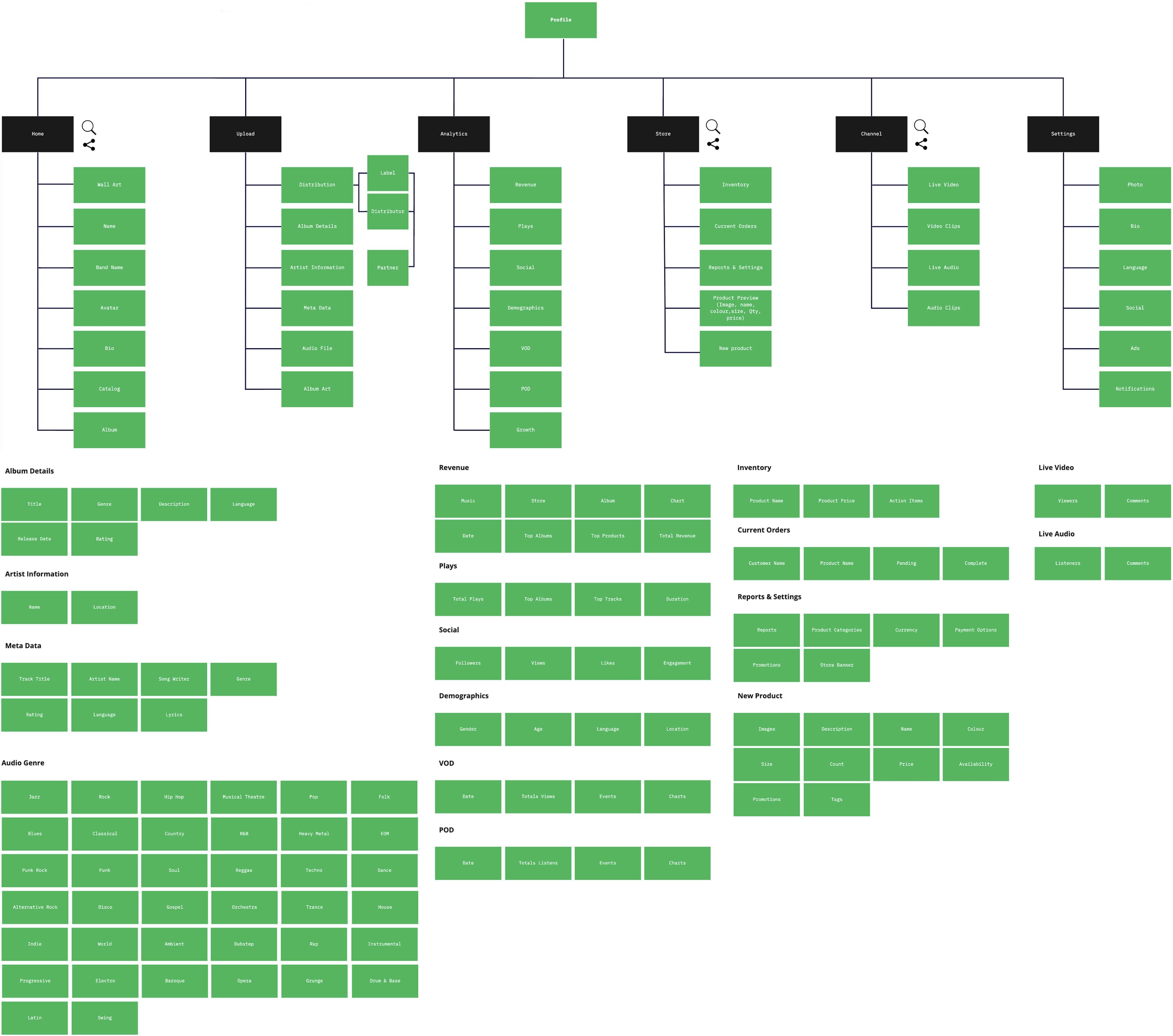
Information Architecture
The Information Architecture shows the relationship between each view with the application. The hierarchy was revised with each iteration of the prototype.
Designing Stage
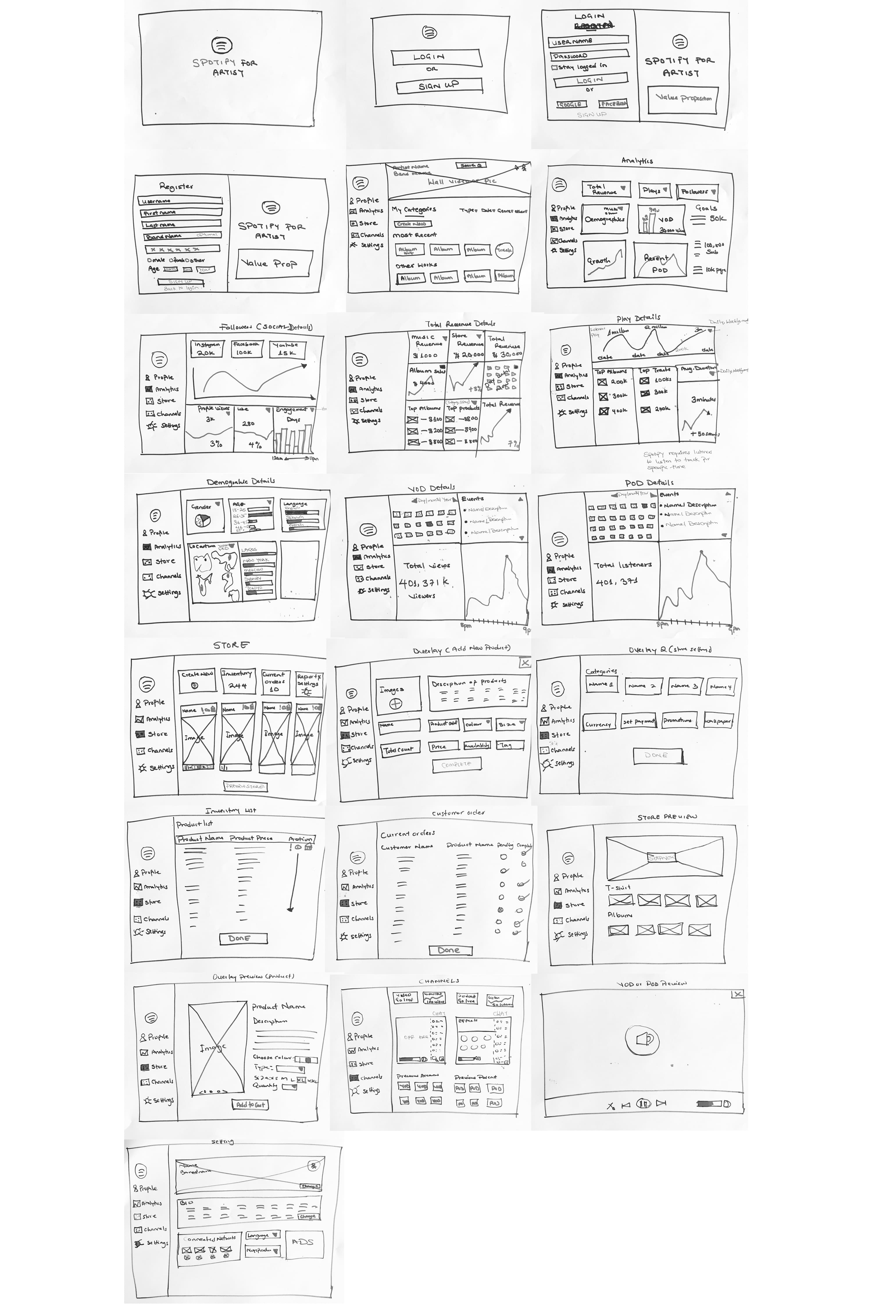
Wireframes - Low Fidelity
We sketched out screens for the application with the necessary features. This allowed us easily to generate and refine different concepts and variations to the design prior to creating a medium fidelity interactive prototype.
Wireframes - Medium Fidelity
The wireframe designs were further refined and digitized with user interaction added in order for the designs to be later tested.
Usability Testing
Two rounds of Usability Testing were done in order to validate our designs. A test plan, test script and task activity list were created after which scheduled participants whom we previously recruited, attempted the set of predefined tasks. Remote Usability Testing, was utilized in this case due the COVID-19 Pandemic and social distancing recommendations. After each test round, the designs were improved based on observation and feedback.
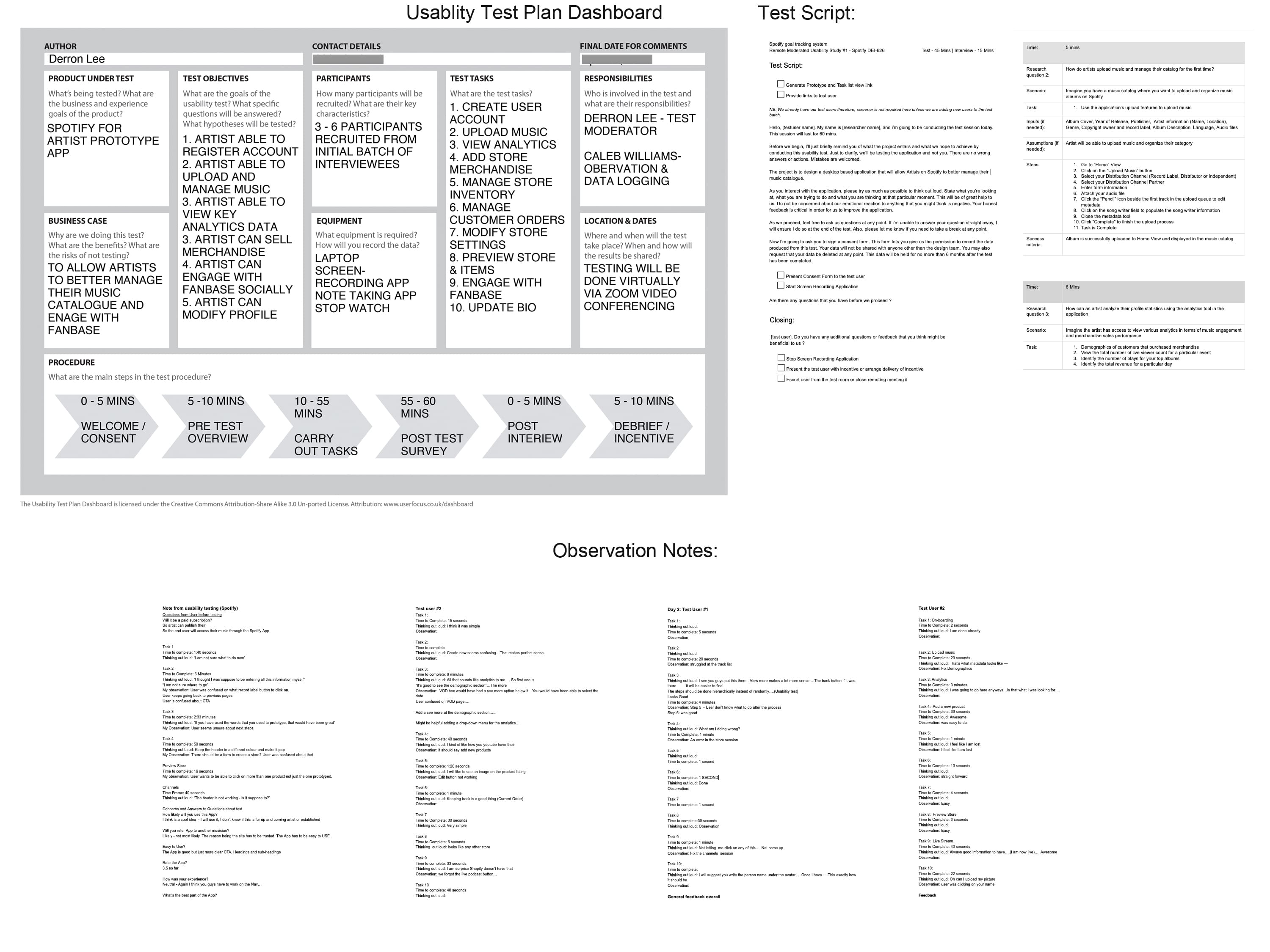
Initial Test Findings:
Solutions:
Feedback on Design Iteration:
Having clearly labelled options for categories and subcategories helped in exploring the app more confidently.
I felt like i'm in full control of everything, from posting music to checking statistics for my live streams.
Things were smooth and clearly labelled
It went fast and easier than the last time
Test Summary:
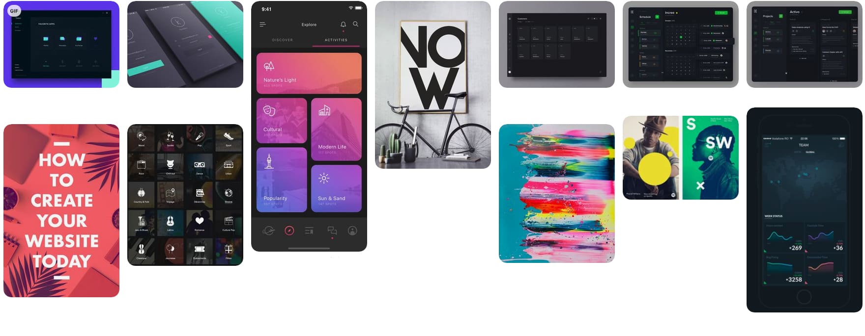
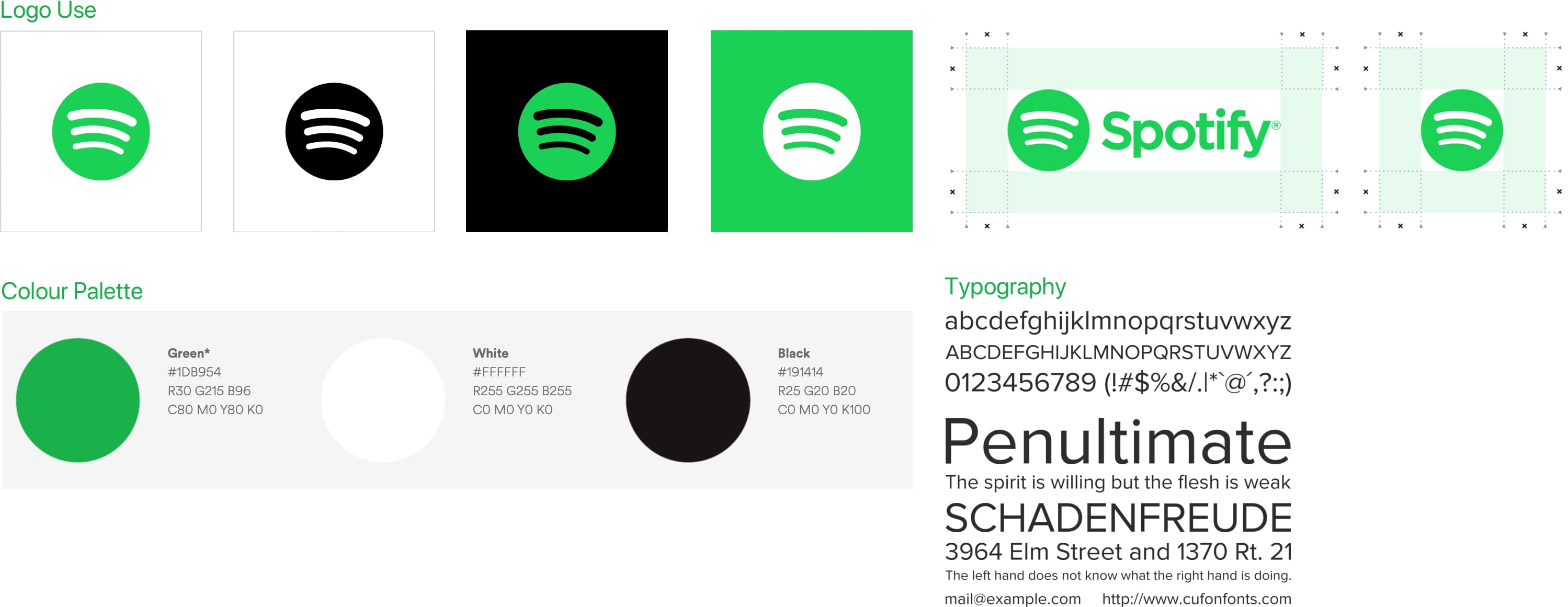
Visual Design - Mood Board & Visual Elements
We decided to incorporate Spotify's existing brand and visual elements into our High Fidelity User Interface Design. The app's theme would therefore be consistent with the already existing client application. Additionally, we created a Mood board to inspire the overall aesthesis of our design and unique features that would be present within the app.
Visual Design - High Fidelity
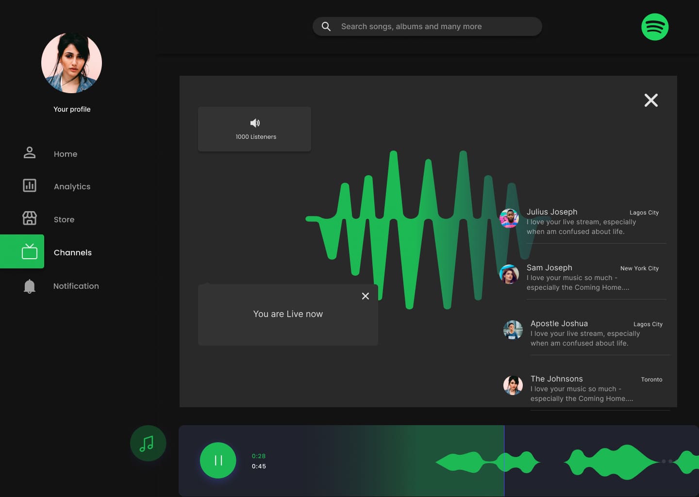
The "dark themed" visuals of the application and high contrasting colours to aid with visual disabilities, delivers an easy to use music catalog manager, engagement analytics, ecommerce and social networking features.
App Highlights
All Screenshots
Reflection
I've always incorporated some aspects of UX and Design Thinking into my previous works but as this was my first UX specifc project, I welcomed the challenge and embraced the role in leading an efficient and productive team in person and virtually.
Producing a conceptual design backed by research, has reminded me how important it is for designers to emphatize with the intended audience in order to have a deep understanding of the problems that are being addresed. I've learnt a great deal about the music community and industry as well as what the artist as an indiviual has to overcome in order to achieve fame and success. It has certainly been an eye-opening experience.
Overall, I'm happy that the prototype's design and its features were well received and look forward to the possiblity of Spotify integrating our concept into future updates of their app.