Twig
That's the way things come clear. All of a sudden. — Madeleine L'Engle
I had a sudden realization that if something were to happen to me that very moment, it would be a while before anyone would realize that I needed help. I then had an idea and a year later, Twig is available on both the App and Play Store.
I’m very passionate and excited about this project as I truly believe it will help save lives.
Summary
Motivation
Every so often I hear stories of people being neglected, having emergencies or have died and no one was aware until it was too late.
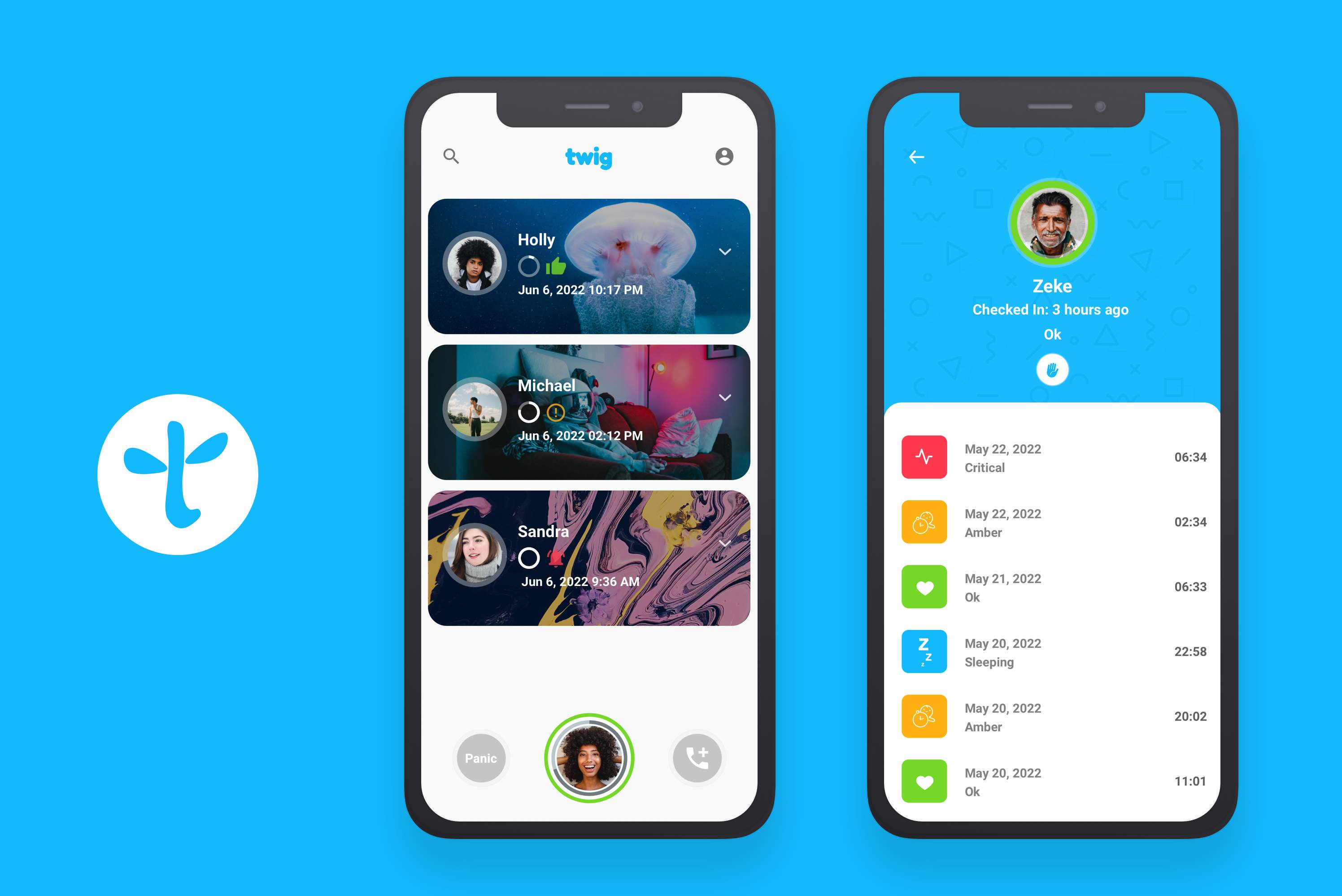
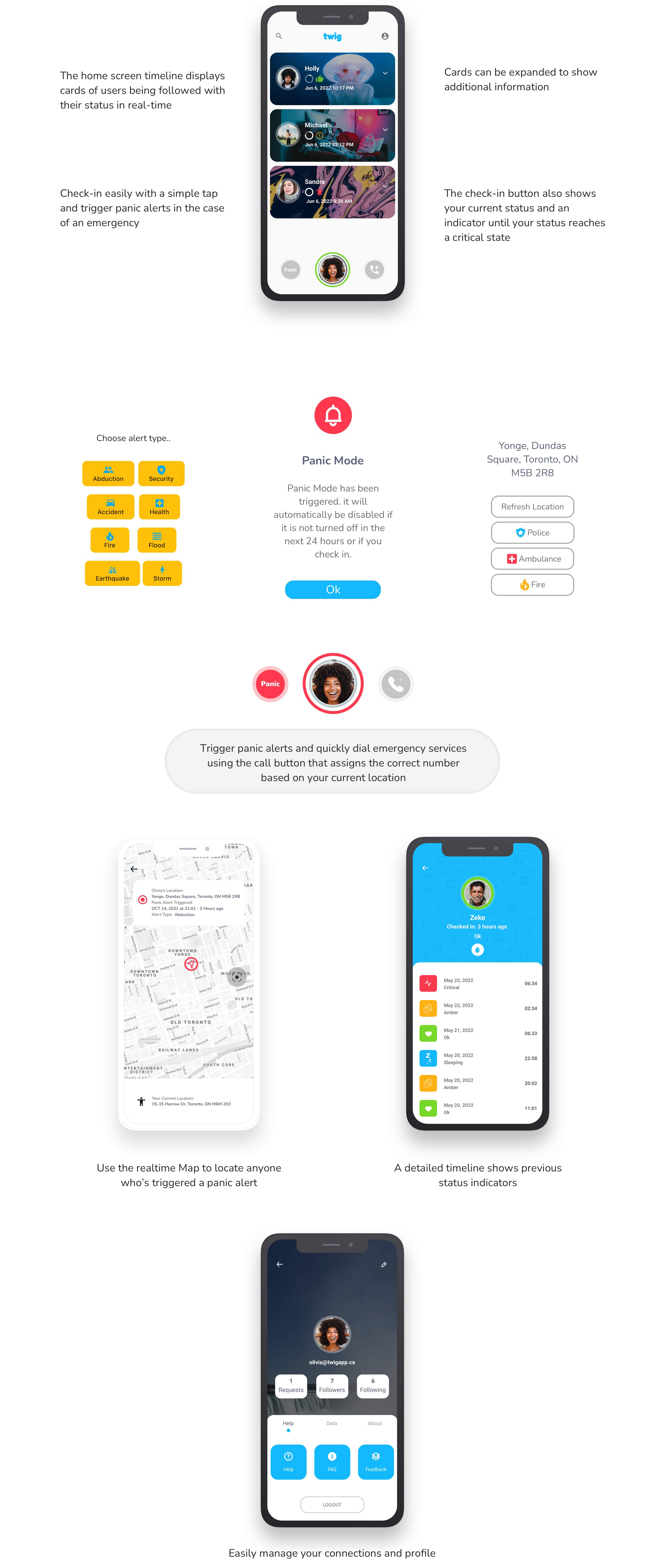
Twig provides friends and family the ability to check-in and check-up on each other in realtime. Each user status is indicated via timeline based cards. Each card can be expanded to show additional information.
A status update occurs whenever a user checks-in or automatically in the backend as time passes by. Various notifications will be sent to users and their followers based on their status at a particualr time.
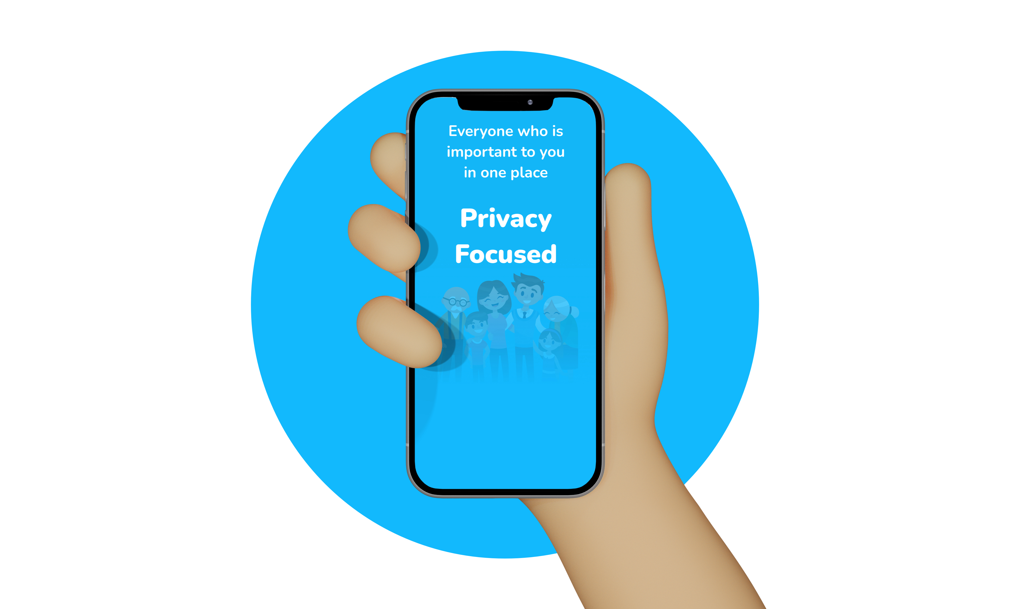
The ultimate goal of twig, is to provide a privacy focused and reliable platform for users to engage with and be alerted in the event a loved one or friend is in urgent need of assistance.
Twig is maintained by an in app subscription which keeps the platform free of ads and ensures users are not targeted or have their data sold to maintain any of the app's features.
One Man Startup..
This app really drew on all my talents as I've had to wear many hats from Design to Engineering and Marketing. I started working on Twig during my final semester of the Master of Digital Experience Innovation grad program at the University of Waterloo. The challenge and my personal circumstances kept me motivated so that I could create a product that would have a positive impact on society.
Who knows what will become of the app in the future but for now, I enjoy working with on Twig during my spare time primarily by myself until more human resources are available.
Research
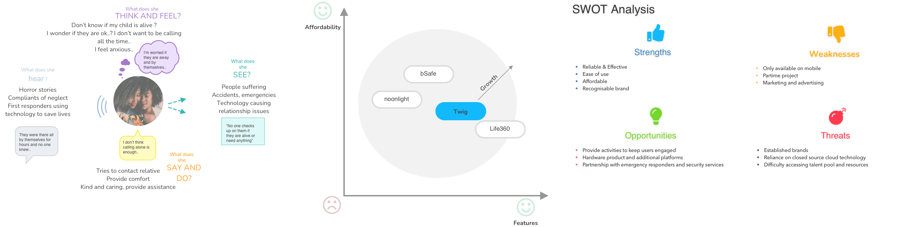
I applied my knowlege of User centred Design and Design Thinking to conduct informal interview sessions with friends and colleagues to get a better understanding of the userbase that I would be targeting. The data gathered was synthesised in order to validate my hypothesis and inform my design choices:
- I believe in saving lives by developing a safe and engaging platforming that keeps friends and families connected with each passing minute.
Userbase
The targeted users would primaily be individuals who live alone, families, carehomes workers and the elderly. Summary of key findings included:
Industry Research
Additional reaserch was also conducted to identify solutions that might have already existed and potential competitors to the platform.
Design
Through multiple iterations prior to and during development, the design of Twig changed continously but maintained the core requirements that would facilitate an easy to use app while providing a unique and enlightening user experience.
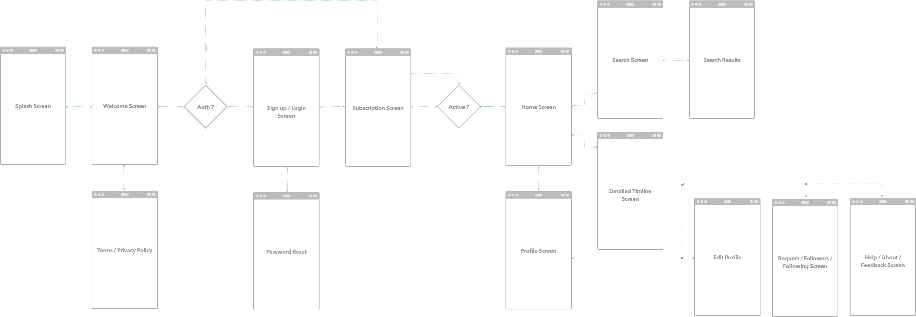
Userflow
Twig's Userflow, makes it quick and easy to onboard new users. A registration form allows relevant information to be entered after which a subscription screen is presented letting the new users subscribe to one of two packages.
Once the subscription is complete, they are taken to their home screen which provides a short interactive walkthrough of the app's features. Users can then search and follow others which will then populate the home screen's timeline.
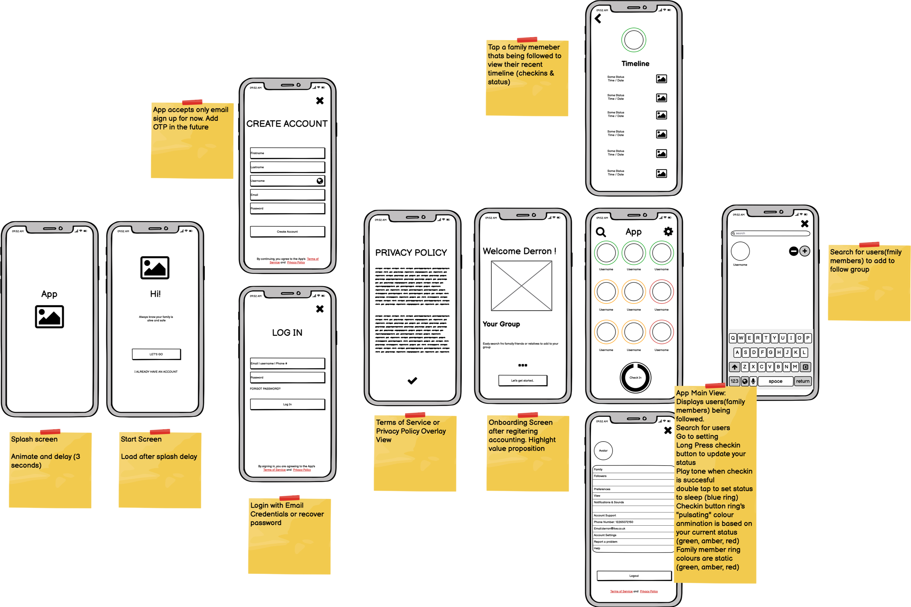
Wireframes
The UI was actually first sketched on sheets of paper when I first though of the app but was then later designed digitally using Balsamiq Wireframes for Desktop.
Again, the wireframes changed quite a bit througout the development cycle based on research, feedback and as additional ideas that came to mind. The first iteration is shown below:
Visual Design
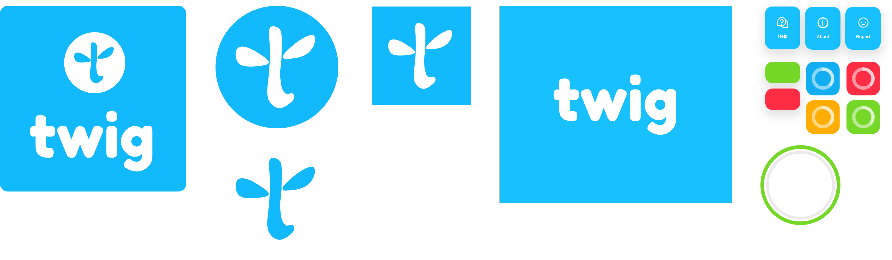
The logo’s shape designed in Sketch from simple bezier curves and inspired by a twig of course, highlights the branching of families and network of friends as do trees in a forest.
FredokaOne is used for the logo type to evoke a sense of boldness and fun in what the app is trying to achieve. I wanted twig to be a brand that would be easily recognisable and known for providing a safe environment but without the negative connotations that are generally associated with such applications.
I wanted the colour palette to be neutral and common across cultures. The blue coloured logo would convey to users a sense of calm and reassurance as well as increase brand recognition due to the fact that blue is associated with well established organisations.
UI elements would consist of rounded edges to break up uniformity and subtle shadows for depth. The UI also makes use of translucent effects and micro interactions to provide a visually appealing and satisfying experience.
Engineering
Twig actually uses quite a few cloud services and Flutter as the mobile UI development framework. Code builds and deployments are automated for the app as well as the website.
The company's website is a static based site (HTML, CSS, JS) and leverage CDN's for faster serving of assets. More about this in future blog post on company's blog page here.
Solution
App
Since its inception on three pieces of paper, the idea of what Twig is has expanded to include not only a check-in button but also a panic button and emergency calling features.
Each feature is highlighted below:
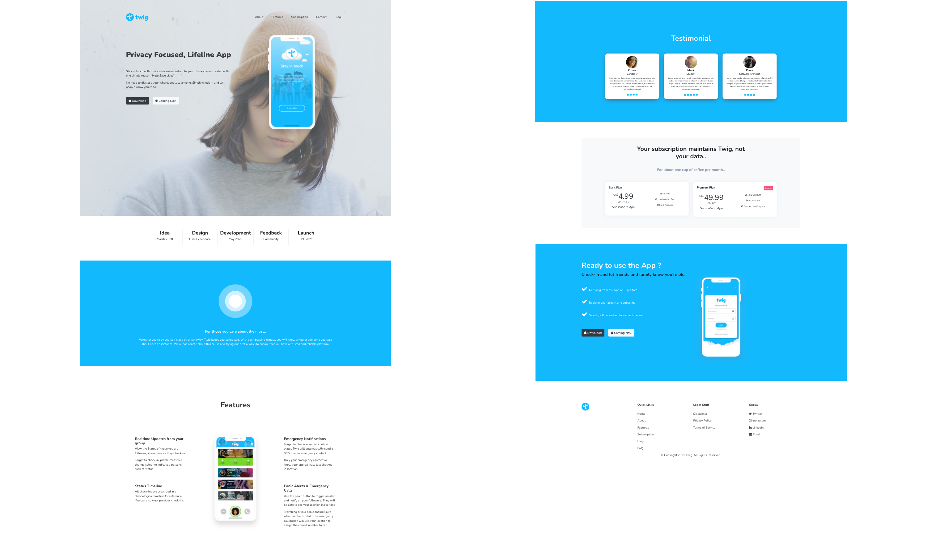
Website
I also created a single page static site for app.
Reflection
What started as a simple idea, has now become a full featured product. I'm really happy with what i've accomplished given the fact that I never coded with Dart or work with Flutter prior to developing Twig. There were quite a few frustrating moments but I persevered witht the vision in mind and solved each challenge a day at a time. It's also a great feeling hearing users acknowledge the app being a necessity in their daily lives.
There's alot more that can be done but for now, i'll continue to provide incremental updates in order to improve the user journey and optimize the application for scalabilty. I hope to also conduct an offical UX study to inform future design choices.
To everyone who's supported me along the journey, thank you.